fbpx
Studio Tips How Do I Get Out of a Creative Block?

Studio Tips How Do I Get Out of a Creative Block?

Q: How do I get out of a creative block?

Do you ever feel like you are creatively ‘stuck’? Or have you felt all your design ideas flitter away when presented with a blank page? Every creative encounters roadblocks on their artistic journey. Our mission at Creative Studio Collective is to guide you through these challenges, helping you rediscover inspiration in your art practice.

Here are a couple of tips to help you when you’re in a creative block:

  • Look for inspiration in different places. Take a walk outside, explore a museum, observe the world around you.
  • Observe other artists. Check out what your peers are doing, talk to them or read interviews.
  • Take a break from your work. Take a break and stretch your creativity in a new way. Maybe it’s sitting at the piano, or playing with clay, or pressing flowers. Step away from the art you normally create and allow yourself to create in a different way with no expectations attached to it.
  • Try something new. Experiment with different mediums, styles, or techniques.
  • Brainstorm and make lists. Think of different ideas and write them down.
  • Keep an inspiration journal. Collect images, quotes, or words that inspire you, if you start this before you get a creative block you will have lots to pull from when it strikes.
  • Read and watch. Explore the works of other artists or watch a movie or documentary.
  • Take a class. Learn something new and challenge yourself.
  • Join an Art Challenge. Joining the community in art challenges, is a great way to create new things & break a creative block or you could just make up your own challenge by using drawing prompts & pull them from a jar to spark new ideas.
  • Get out of your comfort zone. Go and explore new places. 

    Feeling stuck in your creative process can be disheartening, but it doesn’t have to halt your progress. Our Monthly Portfolio Building Creative Design Briefs are specifically designed to rekindle your inspiration and provide a structured path to not only overcome creative blocks but also to refine your skills, build an impressive portfolio, and achieve your artistic goals.
    Dive deeper into your creative potential and break free from those blocks. Click here to explore our Monthly Portfolio Building Creative Design Briefs and start transforming your art journey today.


Talk soon!
Fleur & Ryann

Studio Chat – Falling Forward

Studio Chat – Falling Forward

Studio Chat: FALLING FORWARD
Embracing growth in the
creative journey

Embarking on a creative journey is full of excitement, potential, and yes, the inevitable setbacks. It’s in these moments of challenge that we need to embrace the concept of “failing forward”.

Rather than viewing mistakes as roadblocks, we have come to understand them as invaluable opportunities for learning and growth.

As a creative, mistakes are inevitable. It is essential to cultivate a positive perspective, seeing these missteps not as failures but as stepping stones toward success. The creative industry, with its ever-evolving landscape, demands resilience in the face of rejection and a rejection of the notion of perfection.

Let’s reimagine the language we use; instead of “failing,” let’s embrace the term “growing.” Missed opportunities aren’t dead ends but chances for personal development. Rejections, rather than being seen as ‘closing doors’, offer valuable feedback that can propel us forward.

Persistence and consistency are the unsung heroes of the creative process. Each setback, each rejection, should serve as fuel to refine our craft and push towards our goals.

So, here’s to failing forward – to embracing growth, learning from every experience, and encouraging a community that thrives on inspiration rather than competition. Let’s normalize failure, celebrate progress over perfection, and keep moving forward, for in each setback lies the seed of a greater success.

If you would like to hear more details on this topic, including how to deal with feedback, revisiting opportunities, cultivating emotional resilience and stretching boundaries then hop on over to our studio library to listen now!

If you would love to dive into this topic more then get FREE ACCESS TO OUR STUDIO CHAT LIBRARY  HERE

There is an entire video library of chats and it’s totally FREE!

In the library we cover topics including:

– Raising Your Prices

– Kickstarting Consistency in Your Art Practice

– Industry Myth Busting and lots more

Creative Brief Tip Don’t Forget Your Pinterest Board

Creative Brief Tip Don’t Forget Your Pinterest Board

Creative Brief Tip

Creative Brief Tip – Don’t Forget Your Pinterest Board!

As a designer, you’re constantly on the lookout for that spark that will ignite your imagination and help you craft something  extraordinary. Thankfully, there’s a hidden gem right at your fingertips to assist your creative process: the Pinterest board that accompanies your brief!

Here’s why you should never overlook this valuable resource:

Visual Storytelling: Pinterest is a visual platform, and the pins on your board tell a compelling visual story, specifically related to your brief. You’ll find stunning images, colors, typography examples and more that tie directly into your current brief. This makes it easier to envision the final result and stay on track with the brief’s goals.

Diverse Perspectives: It is a fast and simple tool to explore various styles of art and approaches to a brief that you might not have encountered otherwise.

The Pinterest board that accompanies your brief is a treasure trove of inspiration waiting to be tapped. Don’t miss out on this invaluable resource that can transform your creative process and help you craft exceptional designs.

Talk soon!
Fleur & Ryann
Studio Tips How do I Create a Balanced Colour Palette

Studio Tips How do I Create a Balanced Colour Palette

Q: How do I create a balanced colour palette?

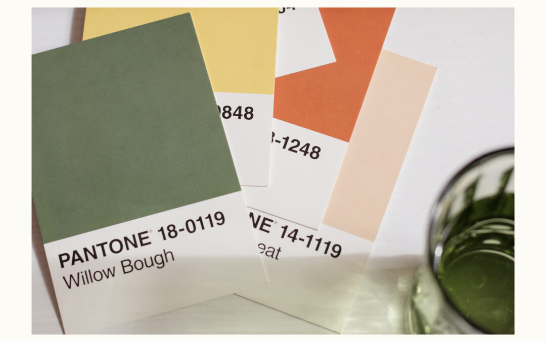
Do you find it difficult to get your colour palette right? Creating a balanced colour palette may seem daunting, but we’ve distilled the process into manageable steps to help you achieve harmony and contrast in your designs effortlessly:

Select a Base Colour: Begin with a primary colour that embodies the mood you’re aiming for. This colour will serve as the foundation of your palette.

Choose a Complementary Colour: Find a colour that contrasts with your base to add depth and interest. This secondary colour should enhance the appeal of your primary colour, not clash with it.

Incorporate Two or Three Accent Colours: Add layers to your palette with a few accent colours. These can be shades or tints of your base color or other colours that share a similar hue or temperature, adding richness and diversity to your designs.

Include a Neutral: Integrate a neutral tone like white, black, or grey. This addition will balance your palette, offering flexibility and grounding the more vibrant colors.

Test Your Palette: Visualize your palette in action by applying each color to a square and overlapping them with the others. This exercise helps you gauge the harmony within your palette and adjust for better contrast and visibility.

If you find some colours blend too closely or lack sufficient contrast, tweak their brightness or saturation for optimal distinction and impact.

Struggling to craft the perfect color palette? Our Monthly Portfolio Building Creative Design Briefs go beyond basics to streamline your process and elevate your portfolio. Get ready to transform your approach with strategic colour schemes designed for impact. Click here to unlock your creative potential.

Talk soon!
Fleur & Ryann

Studio Chat – Kickstarting Consistency

Studio Chat – Kickstarting Consistency

Studio Chat: kickstarting consistency

Here at Creative Studio Collective, we have some thoughts on how to kickstart consistency in your art practice. – there is so much power in a consistent art practice, just five minutes a day and your small steps can lead to significant results. You can even squeeze it in while waiting for kids or sitting in the car.

We think that embarking on a 100 Day Challenge is one of the best ways to kickstart consistency in your Art Practice. Taking part in a challenge takes commitment and courage –  courage to SHOW your art to the world, even those pieces that you think are ‘ugly’. But don’t be scared – you can find incredible support from your online community, they can help encourage you and keep you accountable so that you finish the entire challenge.

The 100-day art challenge is not just a commitment; it’s a turbo boost to creativity. It’s an invitation to overcome fears, push boundaries, and experience accelerated growth in artistic skills.

Through vulnerability, consistency, and a supportive community, you can turn a blank canvas into a vibrant collection showcasing personal and creative growth.

If you would like to hear all the details on this chat, including tips on resources and supplies, challenge duration, overcoming the fear of the blank canvas, pushing beyond your comfort zones and discovering your unique style, then head on over to our video library to listen!

If you would love to dive into this topic more then get FREE ACCESS TO OUR STUDIO CHAT LIBRARY  HERE

There is an entire video library of chats and it’s totally FREE!

In the library we cover topics including:

– Finding Success with Art Challenges

– Keeping Your Instagram Account Safe

– Industry Myth Busting and lots more

Creative Brief Tip How to use Colour Palettes

Creative Brief Tip How to use Colour Palettes

Creative Brief Tip

Creative Brief Tip – How to use Colour Palettes from a Mood Board

Colour palettes allow us to tell stories, evoke emotions, and make a lasting impression with our artwork. Whether you choose to use the colour palettes as they are presented in the mood board, or as a springboard for your own creations, let’s dive into the power of colour and its profound impact on design.

Understanding the Power of Colour:

Colours hold immense power. They can influence emotions, convey messages, and even drive purchasing decisions. When choosing a colour palette, it’s crucial to consider who your target audience is and what you want to convey to them. The colours you select should resonate with your audience’s preferences, values, and the message you aim to send.

The Psychology of Colour:

Every colour has a unique psychological impact. For instance, red can evoke feelings of passion and urgency, while blue often signifies trust and reliability. Green symbolizes nature and tranquility, and yellow radiates warmth and optimism. By understanding the psychology of colour, you can create designs that connect with your audience on a deeper level.

Exploring Prevalent Colours in the Market:

Before creating your colour palette, it’s wise to take a look at the colours already dominating the market in your niche. This can provide valuable insights into consumer preferences and help you stand out or blend in, depending on your design goals.

Creating Your Unique Palette:

However, to truly set your design apart, you might want to craft a custom colour palette. This involves mixing and matching colours to suit your brand’s identity or your designs specific goals. Keep in mind the emotions you want to evoke and the messages you want to convey. Experiment with different colour combinations and test them in your design to see what resonates best.

Harmony and Contrast:

When creating your own palette, consider principles of colour harmony and contrast. Harmonious colour combinations are visually pleasing, while contrasting colours can create dynamic and attention-grabbing designs. Tools like the colour wheel can help you understand the relationships between colours and make informed choices.

The Role of Neutrals:

Neutrals like black, white, and grey are often underestimated but can be a designer’s best friend. They provide balance and can make other colours stand out more effectively. Neutrals also convey a sense of sophistication and timelessness, which can be invaluable in design.

Colour palettes are the essence of design, and they play a pivotal role in shaping the way we perceive and interact with the world. Whether you choose to use the existing palettes or create your own, remember that the colours you choose can have a profound impact on your audience. So, embrace the world of colours, and let your creativity run wild!

Talk soon!
Fleur & Ryann