fbpx
Glitz and Glam Color Palette – How To Customise & Make It Your Own

Glitz and Glam Color Palette – How To Customise & Make It Your Own

Unleashing Creativity: Tips for Customizing the “Glitz and Glam” Palette for Your Collection

When it comes to creating surface pattern designs that truly shine, color is one of the most powerful tools in your arsenal. This month’s “Glitz and Glam” Creative Brief provides a rich, luxurious color palette designed to inspire and captivate. From deep jewel tones to metallic accents, the possibilities for crafting dazzling holiday patterns are endless. But how can you take this starting point and truly make it your own? In this blog post, we’ll show you how to expand on the provided palette to create designs that stand out in both sophistication and creativity.

Why Color Customization Matters

The “Glitz and Glam” theme centers on elegance and sparkle, combining deep emeralds, cranberry reds, and royal blues with pops of gold and silver metallics. While the curated palette offers a fantastic foundation, adding your personal touch through subtle color adjustments or new complementary shades can set your designs apart.

Customizing the color palette allows you to:

  • Align with specific market trends or brand needs.
  • Tailor designs to different product categories, from gift wrap to textiles.
  • Infuse your unique style into the project, ensuring your work is both recognizable and original.

 Step 1: Identify Gaps or Opportunities

Start by analyzing the provided colors for potential enhancements as it applies to your artwork. Ask yourself:

  • What’s missing to make this feel more my style? Could a lighter shade, like a pastel, bring balance to the richness of the jewel tones?
  • What’s overrepresented, or is there a color that just doesn’t feel like me? Would scaling back one color allow another to shine?
  • How can I use metallics creatively? Consider whether gold, silver, or even rose gold would work better for your design focus.

Example: Adding a soft champagne hue could introduce elegance and contrast when paired with the darker emerald and cranberry shades.

    Step 2: Experiment with Subtle Variations

    Within the “Glitz and Glam” palette, small changes can create a big impact. Try:

    • Tints and Shades: Lighten cranberry red into a rosy pink for a softer, romantic twist or deepen it into burgundy for a more dramatic effect.
    • Analogous Colors: Extend the palette by choosing colors adjacent on the color wheel (e.g., teal to complement emerald).
    • Textural Accents: Incorporate foil or glitter overlays to make metallics pop against matte backgrounds.

    Suggested Tool: Digital color palettes in software like Adobe Illustrator or Procreate can help you visualize and fine-tune these variations.

    Step 3: Test Across Multiple Applications

    A palette that works well for home décor may need adjustments for apparel or stationery. Mock up your color experiments on different products, considering:

    • Print-on-Demand Platforms: Vibrant colors like jewel tones may appear differently on fabric than on paper. Adjust saturation accordingly.
    • Seasonal Trends: Jewel tones scream holidays, but blending them with neutrals or softer shades can make designs versatile for year-round use.

    Example: A stationery collection might benefit from muted tones for sophistication, while gift wrap designs could lean into bolder, high-contrast combinations.

    Step 4: Balance Nostalgia with Modernity

    “Glitz and Glam” encourages designers to draw from vintage aesthetics like Art Deco while adding a modern edge. Use color to strike this balance:

    • Pair classic gold and black with a modern pop of electric blue.
    • Integrate unexpected hues, like a soft lavender, to bridge vintage motifs with current color trends.

    Inspiration: Look to vintage holiday cards or Art Deco patterns for timeless ideas and refresh them with contemporary color twists.

    Step 5: Get Feedback and Iterate

    Sharing your palette experiments with peers can yield invaluable insights. Post your work-in-progress in the Brief Community or tag @creative_studio_collective on Instagram.

    Questions to consider:

    Do the colors evoke the festive, sophisticated vibe of “Glitz and Glam”?

    Are the metallic accents working harmoniously, or do they overpower the design?

    Conclusion: Lean into Your Unique Palette

    Expanding on the “Glitz and Glam” color palette is your opportunity to shine as a designer. By thoughtfully tweaking hues, balancing classic and contemporary tones, and testing across applications, you’ll create work that is both cohesive and distinctive. Ready to dazzle? Share your creations and let your colors light up the season!

      Talk soon!
      Fleur & Ryann
      Creative Brief Member Spotlight – Sharron Binns

      Creative Brief Member Spotlight – Sharron Binns

      Creative Brief Member Spotlight – Sharron Binns

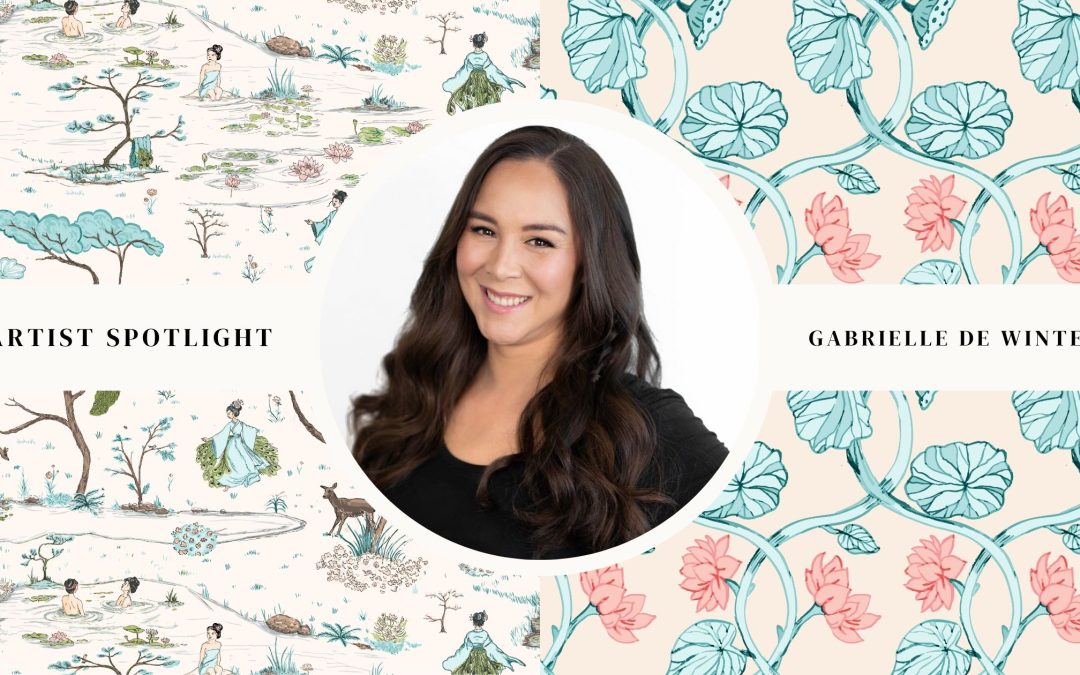
      Artist Spotlight Sharon Binns

      January 13, 2025

      Sharron has recently launched herself as a surface pattern designer.

      Based in the scenic Mackenzie Country in the middle of the South Island, New Zealand, Sharron has a limitless amount of design inspiration surrounding her.

      Discovering surface pattern design later in life has opened up a whole new career for Sharron that has allowed her to completely reinvent herself and discover talents she knew deep down she had but never had the chance to use them.

      If you would love to see more of Sharron’s designs click here


      The creative briefs are a wonderful way to be accountable.

      SPD starts out as a hobby for most people but with these briefs you feel like a real designer with a real brief from a real customer!

      They are a tangible asset that not only builds your portfolio, but goes a long way to help you discover and fine tune your own style.

      My Top Tip: 

      My advice to anyone doing these briefs is finish one brief before going onto the next! It’s so easy to spend a month working on a brief and before you know it another is on your doorstep. It’s like having a monthly book subscription. It’s so exciting receiving the next book but before you know it you have half a dozen unread titles.

      Creative Brief Member Wins


      My Spoonflower shop has certainly been more active since starting the briefs and that has pushed me to get my brand new website up and running!

      Well done Sharron!

      We love hearing from our Portfolio Building Creative Design Brief members on how they love our Design Briefs & their hot tips for working with them! if you are a member & would love to be featured submit below.

      If you are not a member yet & would love to learn more about our amazing design tool to help you build your portfolio like a pro then click the button below to learn more.

      At Creative Studio Collective, we’re all about crafting fantastic design tools for Surface Pattern Designers, Textile Designers, Artists & creatives that support you on your creative journey, allowing you to focus on the enjoyable aspects while we handle all the strategic thinking and planning for you! 

      Studio Chat – Our Five Favourite Art Supplies

      Studio Chat – Our Five Favourite Art Supplies

      Studio Chat: our five favourite design tools

      Today we are here to spill the beans on some of our favorite art supplies and design hacks that have been total game-changers for us!

      Let’s dive right in, shall we?

      1. Tombow Markers

      First up, let’s talk about markers. If you’re anything like us, you’re a die-hard Tombow fan. Those markers are like magic wands in the hands of artists! We also love Posca pens. They’re refillable, versatile, and perfect for adding a pop of color to any project. Plus, they work wonders on various surfaces, from paper to shoes!

      1. Paperlike Screen Protector

      A must-have for digital artists: a screen protector called Paperlike. Trust me, it’s a game-changer! Not only does it make drawing on your iPad smoother, but it also reduces glare, giving you a crystal-clear canvas to work on.

      1. Pantone Packs

      If you’re a designer, you definitely need to get into Pantone! Sure, it might seem like a big investment at first, but having those color guides handy can be a lifesaver when you’re working with clients or suppliers. Plus, they make color-matching a breeze!

      1. Moleskin notebooks

      We love these notebooks! We love the weight of the paper, the fact that our markers don’t seep through the page, and the range of sizes available. We keep them everywhere, in our handbags, at our desk, in the glovebox of the car – they are super versatile for a wide range of art practices and we can’t recommend them enough!

      5. Time Management Cubes

      Ever heard of time management cubes? They’re a simple yet effective tool for staying on track and making the most of your creative hours. We use them all the time – especially for those less appealing tasks that we keep putting off!

      So there you have it, folks! A sneak peek into our toolbox of art supplies and design hacks. Whether you’re a seasoned artist or just starting out, I hope these tips help spark some creativity and make your creative journey a little smoother. Happy creating!

      If you would love to dive into this topic more then get FREE ACCESS TO OUR STUDIO CHAT LIBRARY  HERE
      If you would like to ask us more questions on our 15+ years experience in the design industry, then sign up to become a Creative Design Brief Member, where you have direct access to ask all your questions and a whole library of tailored advice at your fingertips! 

      There is an entire video library of chats and it’s totally FREE!

      In the library we cover topics including:

      – Building A Marketable Portfolio

      – Failing Forward

      – Industry Myth Busting and lots more

      Creative Brief Tip Don’t Miss the Hidden Gems in your Briefs

      Creative Brief Tip Don’t Miss the Hidden Gems in your Briefs

      Creative Brief Tip

      Creative Brief Tip – Don’t Miss the Hidden Gems in your Briefs

      Your Monthly Portfolio Building Creative Brief is not just a set of instructions; it’s a treasure trove of potential ideas, waiting for you. More often than not, when you feel stuck or when your creative juices seem to have run dry, revisiting the brief can be the game-changer. Here’s why:

      Clarity Amidst Chaos: The Creative Brief is like a roadmap for your project. It outlines objectives, goals, target audience, and much more. When you’re overwhelmed with ideas or uncertain about the direction to take, your brief can provide that clarity you are looking for. Revisiting it can help you refocus on the core purpose of your project.

      New Perspectives: Details in your brief might have gone unnoticed during your initial read-through. A second look can bring new insights and perspectives. You might discover nuances, market trends, or unique elements that can breathe fresh life into your work.

      Connecting the Dots: The more you revisit it, the more connections you can make between different aspects of the briefs objective. These connections can lead to creative approaches that you may not have thought of otherwise.

      Validation and Reinforcement: Revisiting your Creative Brief can also reaffirm that you are on the right track. It’s a way of checking if your current ideas align with the project’s goals. This validation can boost your confidence and motivation.

      Reviving Passion: Your brief might contain the initial spark of inspiration that led you to start brianstorming ideas. Revisiting it can reignite that enthusiasm, making you more motivated to start creating.

      So, don’t let your Monthly Portfolio Building Creative Brief gather dust on a shelf. Instead, consider it a living document that you can turn to whenever you need a burst of inspiration. The hidden gems within your brief are waiting to be discovered, and they can transform your project from ordinary to extraordinary.

      Remember, the devil is in the details, and sometimes, so is your muse.

      Talk soon!
      Fleur & Ryann
      Creative Brief Member Spotlight – Jeanette Parks

      Creative Brief Member Spotlight – Jeanette Parks

      Creative Brief Member Spotlight – Jeanette Parks

      Artist Spotlight Jeanette Parks

      December 9, 2024

      Jeanette is a Swedish-American lifelong artist and designer who loves making bold and eclectic designs ranging from painterly florals to retro and nostalgic icons.

      If you would love to see more of Jeanette’s designs click here


      I love the concept of creating a mini collection.

      Each Monthly Creative Brief has an on trend theme and colour palette which provides me with a clear focus each month.

      My Top Tip: 

      Tackling a “hero” pattern first is sort of my modus operandi. I read through the brief and think about what sort of main theme jumps out at me. After I make 1 or 2 hero prints, I spin off coordinates and blenders from that starting point

      Creative Brief Member Wins


      Several of my Creative Brief designs have started getting sales trickling in, and I’m gearing up to submit my mini collections and portfolio to more companies.

      Well done Jeanette!

      We love hearing from our Portfolio Building Creative Design Brief members on how they love our Design Briefs & their hot tips for working with them! if you are a member & would love to be featured submit below.

      If you are not a member yet & would love to learn more about our amazing design tool to help you build your portfolio like a pro then click the button below to learn more.

      At Creative Studio Collective, we’re all about crafting fantastic design tools for Surface Pattern Designers, Textile Designers, Artists & creatives that support you on your creative journey, allowing you to focus on the enjoyable aspects while we handle all the strategic thinking and planning for you!