fbpx
Creative Brief Tip Don’t Forget Your Pinterest Board

Creative Brief Tip Don’t Forget Your Pinterest Board

Creative Brief Tip

Creative Brief Tip – Don’t Forget Your Pinterest Board!

As a designer, you’re constantly on the lookout for that spark that will ignite your imagination and help you craft something  extraordinary. Thankfully, there’s a hidden gem right at your fingertips to assist your creative process: the Pinterest board that accompanies your brief!

Here’s why you should never overlook this valuable resource:

Visual Storytelling: Pinterest is a visual platform, and the pins on your board tell a compelling visual story, specifically related to your brief. You’ll find stunning images, colors, typography examples and more that tie directly into your current brief. This makes it easier to envision the final result and stay on track with the brief’s goals.

Diverse Perspectives: It is a fast and simple tool to explore various styles of art and approaches to a brief that you might not have encountered otherwise.

The Pinterest board that accompanies your brief is a treasure trove of inspiration waiting to be tapped. Don’t miss out on this invaluable resource that can transform your creative process and help you craft exceptional designs.

Talk soon!
Fleur & Ryann
Creative Brief Member Spotlight

Creative Brief Member Spotlight

Creative Brief Member Spotlight

Artist Spotlight Jacqui Slade

Jacqui is a busy mum and surface pattern designer from Sydney Australia.

She loves creating vibrant and fun designs with a modern retro boho beach vibe. She’s totally obsessed with vintage designs, wallpaper, textiles and all things floral.

If you would love to see more of Jacqui’s designs click here

The thing I love about the Portfolio Building Creative Briefs is that each month there is a clear direction of what to create AND it is perfectly timed to what you need to be pitching and uploading to POD each month.

I also love that there is freedom in the briefs to make them completely your style. And I’m now actually finishing full collections rather than just one off designs.

My best advice to stay on track with designing is to pick the brief that resonates with you the most, and then pick the things you want or like to draw. Doing something you like means designing can stay FUN.

If I’m short on time and can’t create an entire new collection, I’ll often use an existing blender pattern or coordinate and recolour it to match to beef out the collection.

We love hearing from our Portfolio Building Creative Design Brief members on how they love our Design Briefs & their hot tips for working with them! if you are a member & would love to be featured submit below.

If you are not a member yet & would love to learn more about our amazing design tool to help you build your portfolio like a pro then click the button below to learn more.

At Creative Studio Collective, we’re all about crafting fantastic design tools for Surface Pattern Designers, Textile Designers, Artists & creatives that support you on your creative journey, allowing you to focus on the enjoyable aspects while we handle all the strategic thinking and planning for you! 

Studio Tips How do I Create a Balanced Colour Palette

Studio Tips How do I Create a Balanced Colour Palette

Q: How do I create a balanced colour palette?

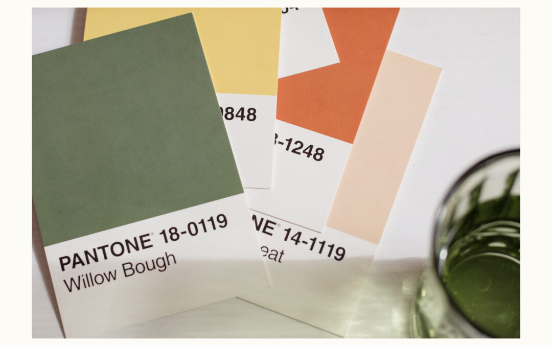
Do you find it difficult to get your colour palette right? Creating a balanced colour palette may seem daunting, but we’ve distilled the process into manageable steps to help you achieve harmony and contrast in your designs effortlessly:

Select a Base Colour: Begin with a primary colour that embodies the mood you’re aiming for. This colour will serve as the foundation of your palette.

Choose a Complementary Colour: Find a colour that contrasts with your base to add depth and interest. This secondary colour should enhance the appeal of your primary colour, not clash with it.

Incorporate Two or Three Accent Colours: Add layers to your palette with a few accent colours. These can be shades or tints of your base color or other colours that share a similar hue or temperature, adding richness and diversity to your designs.

Include a Neutral: Integrate a neutral tone like white, black, or grey. This addition will balance your palette, offering flexibility and grounding the more vibrant colors.

Test Your Palette: Visualize your palette in action by applying each color to a square and overlapping them with the others. This exercise helps you gauge the harmony within your palette and adjust for better contrast and visibility.

If you find some colours blend too closely or lack sufficient contrast, tweak their brightness or saturation for optimal distinction and impact.

Struggling to craft the perfect color palette? Our Monthly Portfolio Building Creative Design Briefs go beyond basics to streamline your process and elevate your portfolio. Get ready to transform your approach with strategic colour schemes designed for impact. Click here to unlock your creative potential.

Talk soon!
Fleur & Ryann

Studio Chat – Kickstarting Consistency

Studio Chat – Kickstarting Consistency

Studio Chat: kickstarting consistency

Here at Creative Studio Collective, we have some thoughts on how to kickstart consistency in your art practice. – there is so much power in a consistent art practice, just five minutes a day and your small steps can lead to significant results. You can even squeeze it in while waiting for kids or sitting in the car.

We think that embarking on a 100 Day Challenge is one of the best ways to kickstart consistency in your Art Practice. Taking part in a challenge takes commitment and courage –  courage to SHOW your art to the world, even those pieces that you think are ‘ugly’. But don’t be scared – you can find incredible support from your online community, they can help encourage you and keep you accountable so that you finish the entire challenge.

The 100-day art challenge is not just a commitment; it’s a turbo boost to creativity. It’s an invitation to overcome fears, push boundaries, and experience accelerated growth in artistic skills.

Through vulnerability, consistency, and a supportive community, you can turn a blank canvas into a vibrant collection showcasing personal and creative growth.

If you would like to hear all the details on this chat, including tips on resources and supplies, challenge duration, overcoming the fear of the blank canvas, pushing beyond your comfort zones and discovering your unique style, then head on over to our video library to listen!

If you would love to dive into this topic more then get FREE ACCESS TO OUR STUDIO CHAT LIBRARY  HERE

There is an entire video library of chats and it’s totally FREE!

In the library we cover topics including:

– Finding Success with Art Challenges

– Keeping Your Instagram Account Safe

– Industry Myth Busting and lots more

Creative Brief Tip How to use Colour Palettes

Creative Brief Tip How to use Colour Palettes

Creative Brief Tip

Creative Brief Tip – How to use Colour Palettes from a Mood Board

Colour palettes allow us to tell stories, evoke emotions, and make a lasting impression with our artwork. Whether you choose to use the colour palettes as they are presented in the mood board, or as a springboard for your own creations, let’s dive into the power of colour and its profound impact on design.

Understanding the Power of Colour:

Colours hold immense power. They can influence emotions, convey messages, and even drive purchasing decisions. When choosing a colour palette, it’s crucial to consider who your target audience is and what you want to convey to them. The colours you select should resonate with your audience’s preferences, values, and the message you aim to send.

The Psychology of Colour:

Every colour has a unique psychological impact. For instance, red can evoke feelings of passion and urgency, while blue often signifies trust and reliability. Green symbolizes nature and tranquility, and yellow radiates warmth and optimism. By understanding the psychology of colour, you can create designs that connect with your audience on a deeper level.

Exploring Prevalent Colours in the Market:

Before creating your colour palette, it’s wise to take a look at the colours already dominating the market in your niche. This can provide valuable insights into consumer preferences and help you stand out or blend in, depending on your design goals.

Creating Your Unique Palette:

However, to truly set your design apart, you might want to craft a custom colour palette. This involves mixing and matching colours to suit your brand’s identity or your designs specific goals. Keep in mind the emotions you want to evoke and the messages you want to convey. Experiment with different colour combinations and test them in your design to see what resonates best.

Harmony and Contrast:

When creating your own palette, consider principles of colour harmony and contrast. Harmonious colour combinations are visually pleasing, while contrasting colours can create dynamic and attention-grabbing designs. Tools like the colour wheel can help you understand the relationships between colours and make informed choices.

The Role of Neutrals:

Neutrals like black, white, and grey are often underestimated but can be a designer’s best friend. They provide balance and can make other colours stand out more effectively. Neutrals also convey a sense of sophistication and timelessness, which can be invaluable in design.

Colour palettes are the essence of design, and they play a pivotal role in shaping the way we perceive and interact with the world. Whether you choose to use the existing palettes or create your own, remember that the colours you choose can have a profound impact on your audience. So, embrace the world of colours, and let your creativity run wild!

Talk soon!
Fleur & Ryann